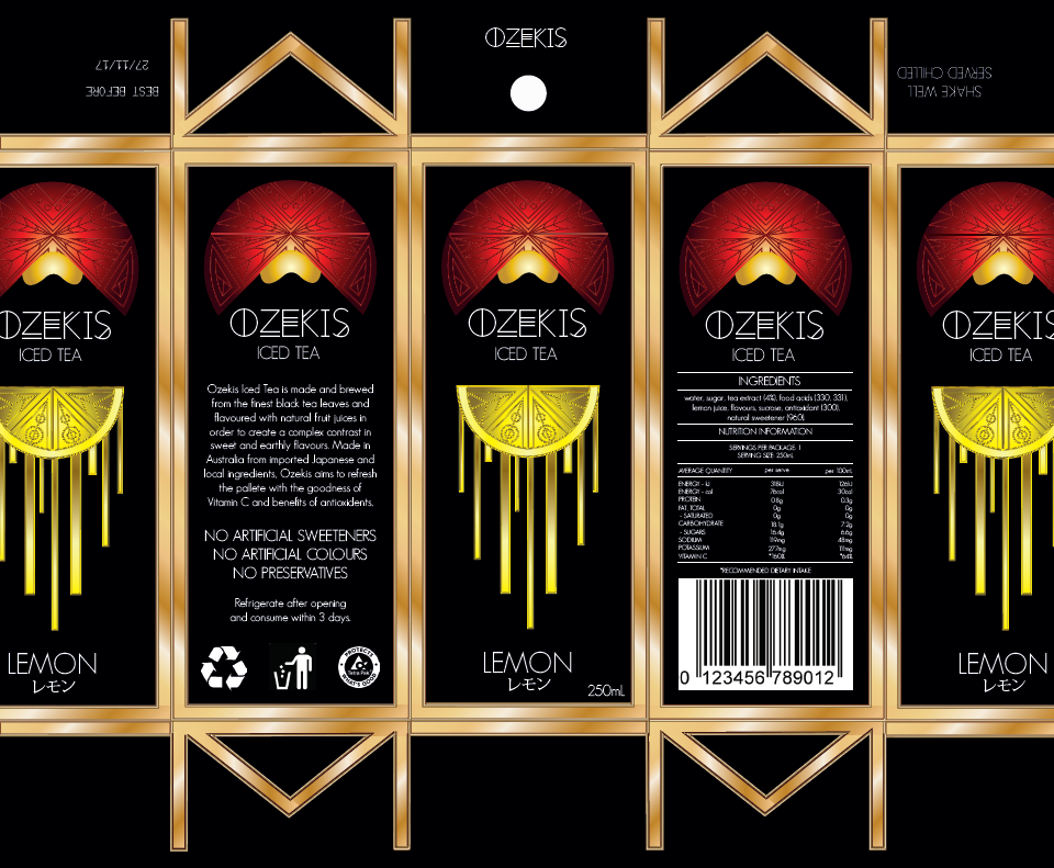
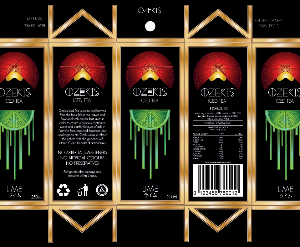
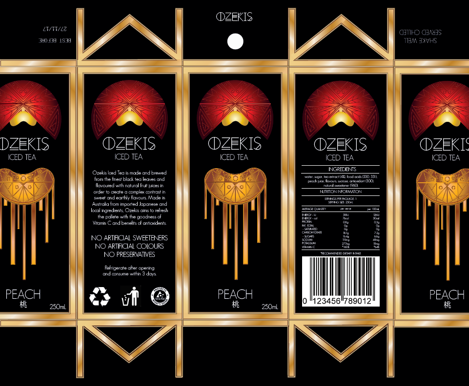
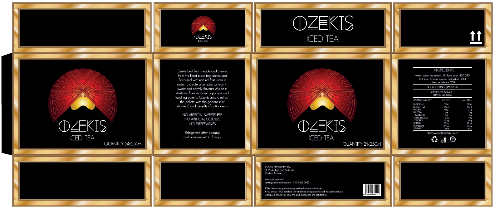
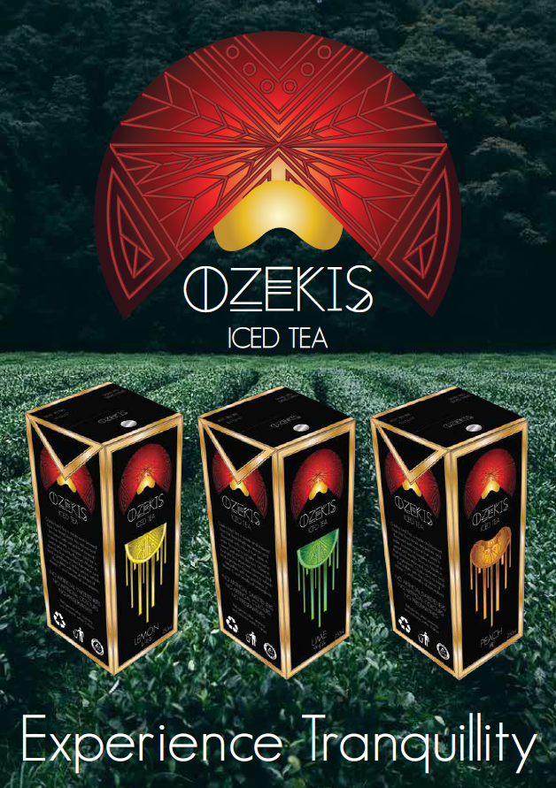
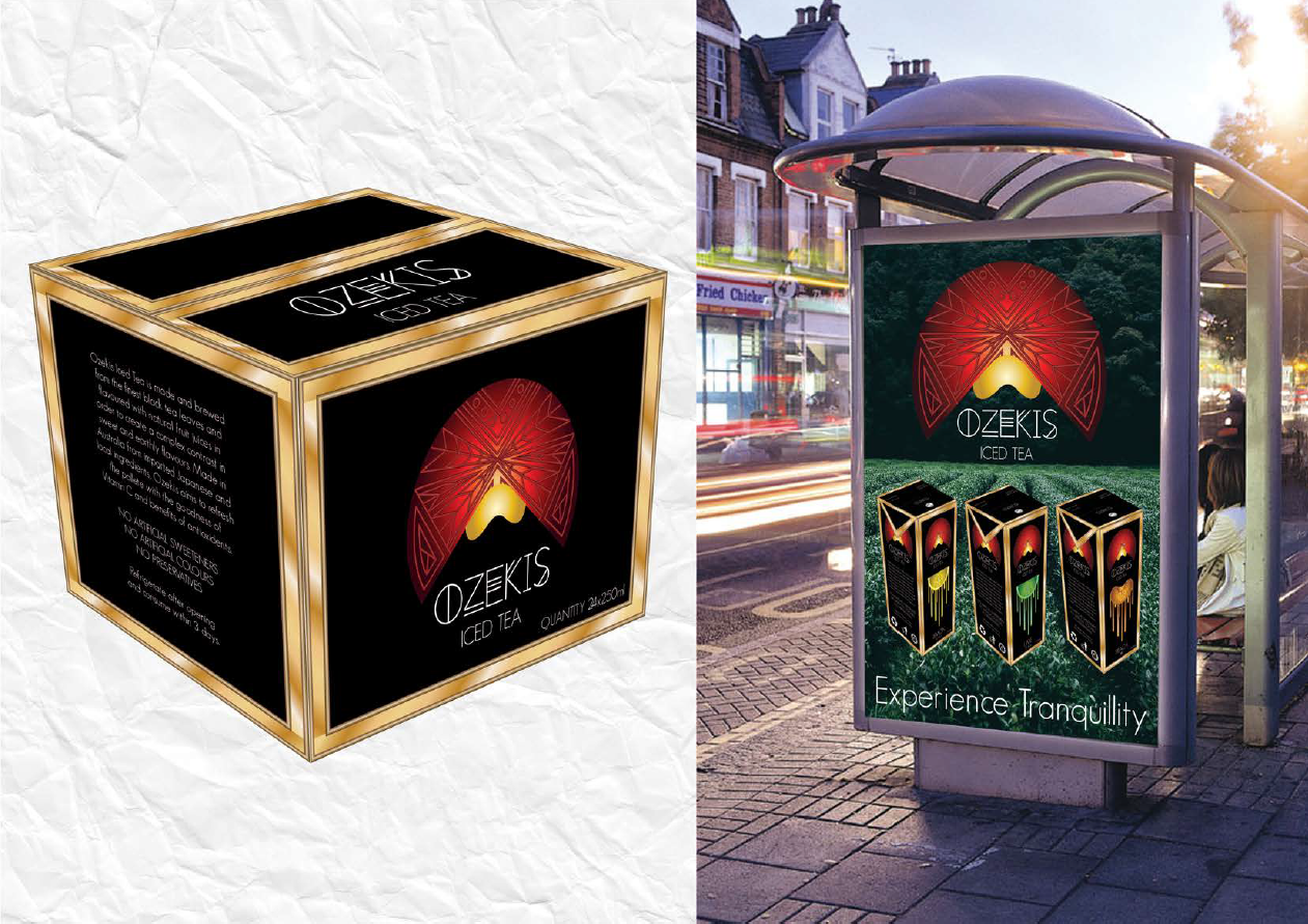
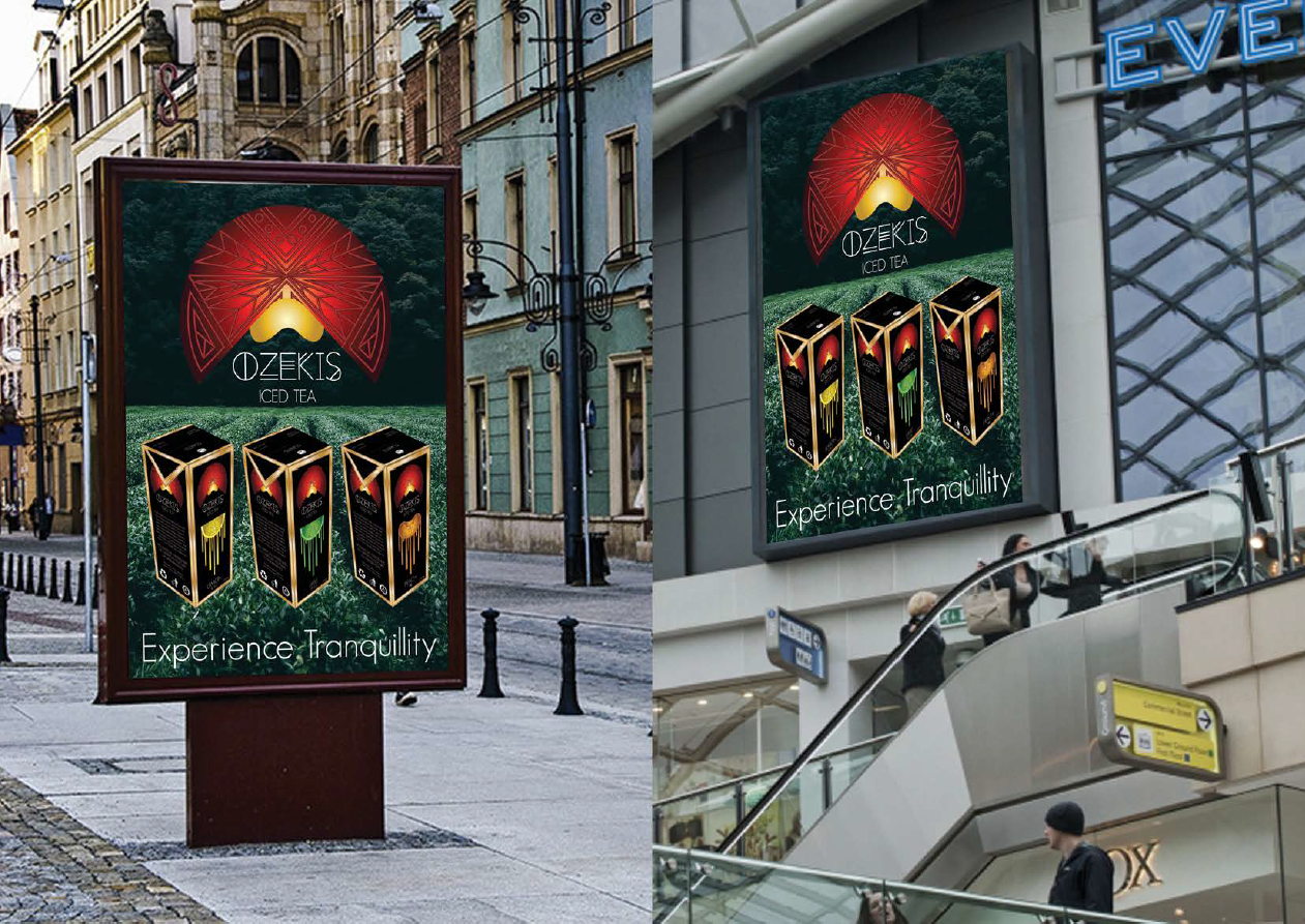

AIM: The aim for Project 2: Packaging, was to produce industry standard packaging ready for print production. This task included creating a drink carton, a shipping box, designing three flavours of a particular product and three touchpoints to convey the brands advertising and target audience.
When setting out for this task, I visited supermarkets to see what types of packaging styles and target markets they lacked. Upon looking at various sections of the supermarket aisle, I noticed most iced teas have overtly detailed and cluttered packaging wrapped around a plastic bottle that are mostly targeted to families, middle class women and iced tea enthusiasts. This surprised me as some tea bag packaging does cater for a sophisticated and premium market through the use of
clever construction, foiling/metallic paper and simplistic yet detailed designs. Motivated and inspired by these guidelines, I aimed to achieve a sophisticated and modern design of iced tea packaging that encompasses both genders and aesthetically driven individuals.
-
Featured in Edith Cowan University's annual School of Arts and Humanities Graduate Exhibition 'ArtsHum 2016' for their student work category - Bachelor of Creative Industries.

NAME: The name ‘Ozekis Iced Tea’ is sourced from the Japanese word ‘Ozeki’ meaning ‘champion’ which has the positive connotations of achievement and status. The name not only matches the Japanese driven logo and design but also has a unique brand name that can be easily remembered.
LOGO: Ozekis’ logo is an image of a sun behind a mountain. The ‘land of the rising sun’ is synonymous with Japan and the mountain represents Mt Fuji which is symbolic of achievement and is globally recognised as a natural wonder. The colours of red and gold both symbolise ambition, wealth and luxury, but also when isolated, red symbolises good luck in east Asian countries like Japan and gold is representative of the sun which is featured in the logo albeit red in colour. These colours against a neutral black background helps provide contrast which is very effective when viewing from a long distance. The use of small detailed geometric patterns are utilised to contrast the big gradient shapes for a dynamic and harmonious relationship.
DESIGN: The design for the box was based off ‘Cocobella: Coconut Water’ which features thin rectangular faces on all vertical sides of the carton and curved edges. I was inspired to use the thinner template than average cartons to convey a more refined and modern look although kept the sharp edges because they mimic the sharpness of the design and they would be harder to make for a physical proof. The gold edges along each side helps the viewer focus and emphasise the content on each side. The font ‘GeoSans Light’ is used for the main body text; because of its sans serif style, it conveys modernity and cleanliness which mirrors the style of the logo and thus producing harmony. The brand’s title font ‘Red Moon Rising Regular’ is used to provide balance through both fonts being sans serif, but the added geometric detail on the letters mirrors the details within the logo.

TARGET AUDIENCE: The target audience for this brand is for both genders, aged from 18-40, middle class, who not only enjoy drinking iced tea, but are aesthetically driven, curious individuals who are health conscious and creative thinkers.
FLAVOURS: The three flavours of lemon, lime and peach were chosen because they are the some of the most popular flavours of iced tea in the market currently and would appeal to a wider audience. Once the audience has been established and accustomed to the brand, then the company can bring out more exciting, complex and ambitious flavours in order to match its sophisticated and unique brand.

The shipping box for Ozekis has been designed with the same minimalist concept and colours as the cartons to reinforce the strong brand identity and to achieve consistency. 24 cartons of Ozekis Iced Tea is the preferred quantity for this box because the cartons material is lightweight, tea lasts long without refrigeration therefore we can use a big box and the quantity is a good size to bulk buy for supermarkets interested in selling the product.

The ad for Ozekis Iced Tea has been designed to be both attract the audience and peak their curiosity. The logo helps identify the brand and the type of product it offers while a short and sweet tagline ensures that even at a glance the consumer gets an idea of the brands image and target message.
The three advertising touchpoint locations; Bus Stops, Billboards and Shopping Centres have been selected based on exposure/visibility and type of audience in order to achieve the best results for image and sales.

Bus Stop adverts can’t be ignored, can’t be switched off and reaches both bus-goers, drivers and an overall wide audience. A study from the UK found that a national campaign of bus stop ads can reach up to 70% of the population within a fortnight which compares favourably to more expensive campaigns on
TV and the radio. Therefore it seems that this type of advertising is very successfully in reaching a wide audience within a small amount of time which is beneficial for getting an ads money’s worth. Most ads can lose their effectiveness at night, this is not the case as the bus stop ads are lit up 24 hours and when placed in prime city spots, can keep advertising the product all through the dark. Other advertising material can easily be ignored
or only viewed for a view seconds, people waiting at bus stops have a longer exposure to the ad than anyone else to absorb the content and consider whether the product will satisfy them.

Billboard adverts are used not to persuade the consumer but to build brands and strengthen a company’s image. Brand recall is one of the most important things to give a consumer in order for the product to become a household name. Being placed in clear vantage point for example up high or within the midst of thoroughfare, can grab and captivate an audience, even if it’s only for a few seconds. Billboards are a good way to get exposure while other options of advertising like magazines and shopping centre ads deals with targeting sales.
Shopping centre adverts are good tools to use to target prospective buyers rather than a broader audience. Consumers are prepared to pay money when they come to a shopping centre so ads centred in this area though invites spontaneous buys while also informing consumers about the brand launch. If the consumers are not spontaneous, they can think about it and buy it at a later stage. A majority of my target audience would be located here as they would be frequent customers at supermarkets and is open to all age ranges and genders.